Building a Throwaway Dashboard with Claude Code
For the past few years I’ve been managing data collection for the AGILE (Adolescent Girls Initiative for Learning and Empowerment) programme, a World Bank initiative operating across two states in Nigeria. A core part of the work involves periodic verification exercises — sending enumerators into schools to confirm that the students we enrolled are still attending.
These exercises are time-pressured and logistically complex. For a typical verification round we might have 40,000 students across 350 schools, a team of enumerators spread across multiple local government areas, and about a week to get it done. During that window, I need to know what’s happening in near real-time: which schools have been visited, which enumerators are actually working, and whether the data coming in looks clean or has problems that need addressing before the exercise ends.
The Old Approach: Python Scripts on a Timer
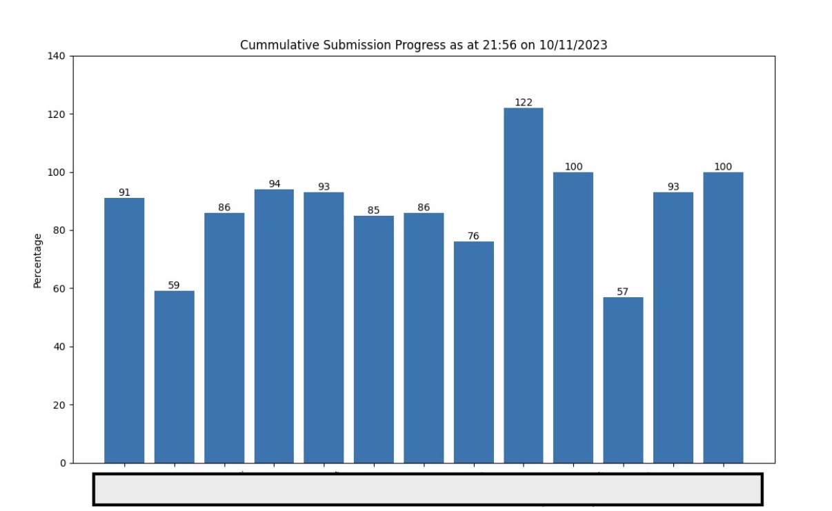
Until recently, my answer to this was a set of Python scripts that I’d run manually every few hours. They’d hit the KoboToolbox API, pull the latest submissions, and produce a bar chart showing percentage progress per local government area.
fig, ax = plt.subplots()
bar_container = ax.bar(percentages.keys(), percentages.values())
ax.set_ylabel('Percentage')
ax.set_title(f'Cumulative Submission Progress as at {datetime.now().strftime("%H:%M on %d/%m/%Y")}')
ax.set_ylim(0, 140)
plt.xticks(rotation=25)
ax.bar_label(bar_container)
plt.show()
It was crude but it worked. The charts gave me an immediate read on progress and could surface anomalies — one state once showed 122% completion in a local government area, which was my first signal that I was dealing with duplicate submissions before I’d even started cleaning the data.
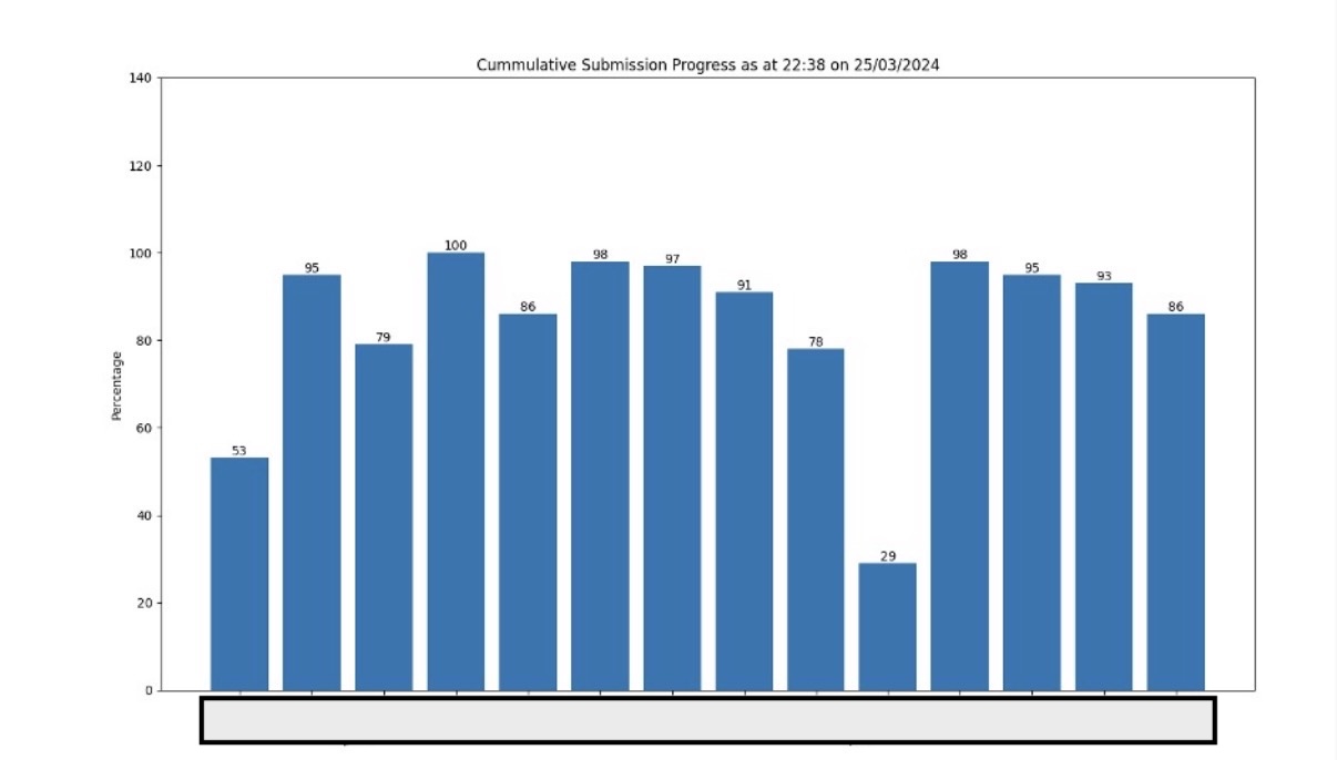
The following year, the same chart came back clean — no bar above 100%, no immediate red flags.
The problem with this approach wasn’t the output — it was the friction. Running a script every few hours meant I was either checking too infrequently and missing things, or I was glued to my laptop running it constantly. A proper dashboard would have solved this, but building one felt like over-engineering a problem that only existed for five days.
The New Approach: Vibe Coding a Dashboard I’d Throw Away
That calculus changed in 2026. With Claude Code, building a dashboard no longer meant days of running the same old script with limited insights. I could describe what I wanted, iterate quickly, and end up with something genuinely useful even for a one-week job.
I started with a clear list of requirements:
- Number of schools visited vs. total expected
- Percentage of enumerators who had submitted at least one form (we’d had cases where one person in a two-person team did all the work, and both got paid, I wanted to catch that early)
- Submission counts broken down by local government area
- Submission counts broken down by individual enumerator
- A map of GPS coordinates from submissions, so I could visually confirm geographic spread
Before writing a single line of code, I fed Claude Code the actual KoboToolbox form. This was important because the form defined the data structure, and having Claude read it directly meant I didn’t have to translate field names or explain the shape of the API response. It could infer the right column names, understand which fields held GPS data, and scaffold the data-fetching logic with the correct structure from the start.
My API token went into a .env file and Claude handled the rest of the setup.
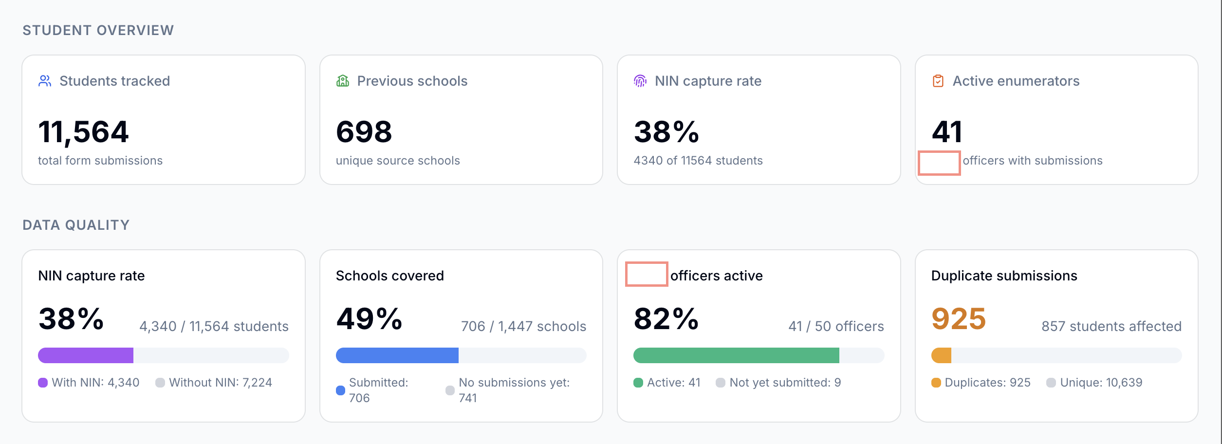
The first draft was not good. The layout was cluttered, some of the percentage calculations were wrong, and the map wasn’t rendering. But that’s where the iteration loop paid off. Rather than debugging from scratch, I could describe what was wrong conversationally: “the active enumerator percentage is counting users who submitted yesterday, not just today” or “the map markers are all landing in the ocean.” Each round of feedback produced a meaningful fix. After about three hours of back-and-forth, I had this:
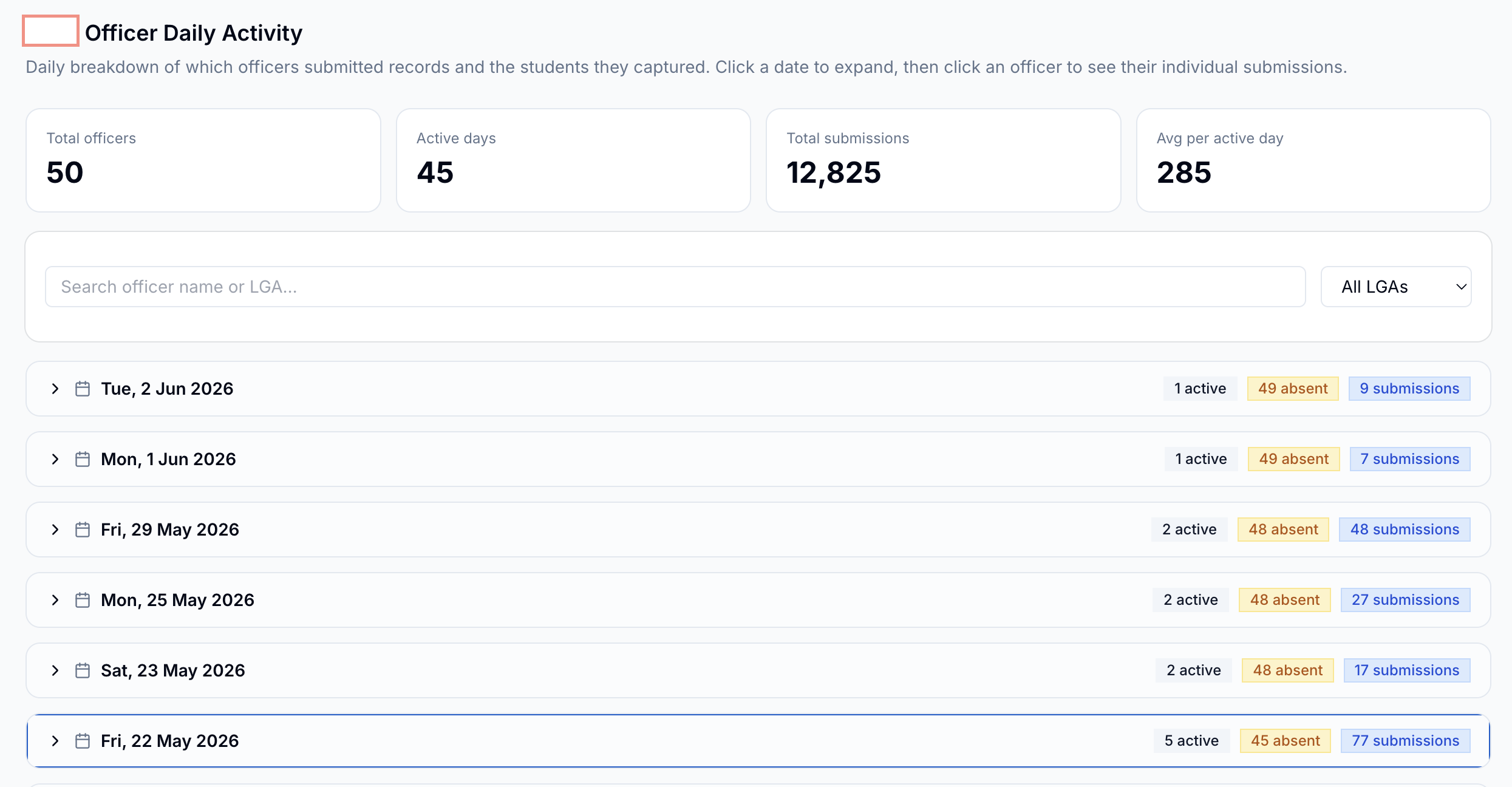
As the week went on I kept adding to it. Daily submission rates became important when I needed to brief the field coordinator each morning, I could tell him how many submissions we had, if the pace was accelerating or slowing down, and who was driving it.
What Made This Work
A few things mattered more than I expected:
Giving the model the form upfront. This single step probably saved an hour of back-and-forth on data structure. I needed Claude to undertood the field names and schema. This avoids domain context errors when working with the data blindly.
Accepting that the first draft is a starting point. The dashboard that was useful on day five looked nothing like what I had at the end of hour one. The finished dashbord was closer to the end of the exercise. Iteration took minutes and data would instantly be live.
The Limits
This was a throwaway dashboard, and it was built like one. The code isn’t reviewd or tested, there’s no error handling for API failures, and it would take real work to adapt it for a different form or a different project. That was an acceptable tradeoff for a five-day verification exercise. It would not be acceptable for anything long-lived.
There’s also a ceiling on what conversational iteration can do. When I hit a subtle bug in how the map was clustering overlapping GPS points, I eventually had to read the code myself and diagnose it directly. Claude could implement a fix once I understood the problem, but it couldn’t find the problem on its own.
I also had to run an independent analysis of the actual data using excel and a bit of python. just to verify data correctness of what Claude was producing.
After the Exercise
Once the data collection window closes, the dashboard gets shelved. The data goes through a cleaning process and then into our main MIS — a separate system that handles student attendance tracking and disbursement management across both states. The dashboard’s job is just to get us through the week in good shape, and it actually did.